So, over the past few weeks The Hubs and I have decided that it's time to tear out the nasty carpet in the living room {that we inherited when we moved in... we did have it professionally cleaned before we moved in so we know there's no lingering stuff under there... just looks gross.} Our family room is right next to the living room with a large doorway, which used to have french doors once upon a time, separating the two rooms. {See nasty, ugly, stained carpet pictured below. Oh, and my little H watching Aladdin. ;o)}
We finally found laminate flooring that we both liked and bought it today! {EEK!!} I had no idea what I wanted for the wall colours though and I had no thoughts on accent colours at all. Luckily Uppercase Living came to the rescue! They've recently featured some mustard & grey tones in their most recent catalogue and at first I thought it was terrible. Buuuut the more I browse the catty, the more I liked it! I found these pictures on google images and it has the colour scheme I'm looking to achieve, but the furniture isn't what I want.
After seeing these inspiring pictures, The Hubs, H, J and I went to fabricland to find some inspiration! Lo and behold, here's what I found:
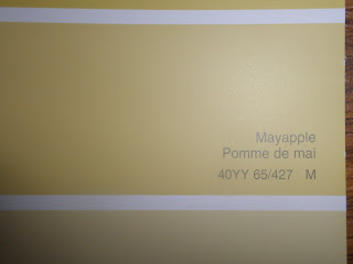
The Hubs liked the fabric in the top picture, and I love the one on the bottom. So we took a sample of each to Rona and found some paint chips that will work. {Oh, and they are laying on top of our new flooring!!}
I have a few more that have some green tones and such in it, but you get the general idea. I have one more picture to show you before I move on to the "help" portion of this blog entry... Here's the sample fabric pieces with our current wall colour... {You can't really tell, but the current wall colour is a light yellow. Sort of a butter cup tone. It happens to go really well with the fabric sample that I like.}
Thoughts please!? Any and all suggestions welcome!!


Okay...so I think you should paint the walls yellow. I think the grey with your white kitchen would feel too cold. And I think that I like Chris' fabric choice, but before I say that for sure I am wondering what are you using the fabric for?
ReplyDeleteOh, good question! I'm using it for the curtians and for one or two throw pillows. I'm thinking I might pull both fabrics into the room, but I only need one of the two for the windows. Thanks for the input!! :D
ReplyDeleteThen I think I will stick with Chris' pick. It seems to have more white in it to pull in the kitchen. And I think the larger pattern will look more dramatic for curtains.
ReplyDeleteThanks for the link again :)!! Grey doesn't have to be cold feeling...I have lots of it in my house...doesn't feel cold does it? If it does let me know;) The good thing about grey is that it will allow you to change the colour scheme in a couple of years without repainting. Yellow is a bit more limiting. Use the mustard tones to accent and you can swap it out easily.
ReplyDeleteI like both the fabrics. The paisley has a more traditional feel but the colours make it current. The bolder pattern will be a real statement if you use it for curtains...I love it and wish I could be so bold. I'm boring with my stripes!!
Tisha...you asked...so I gave ;)
Thanks for the suggestions! I do like the idea of being able to switch up the decor in the future. We are buying the paint on Wednesday, so this will be the topic of discussion tonight in our house!
ReplyDelete